

Blog
3D Letters and Backlit Signage: When Neon Is Not the Answer
Most signs are seen for the first time in daylight. Someone walks up the street at eleven in the morning, or sits in traffic opposite your facade at two in the afternoon, and decides then whether they can read your name. Glow does nothing in that moment. What works at eleven in the morning is shape: letters with real depth, a hard edge and a shadow falling across the wall behind them.
That is the case for fabricated 3D letters, and why we talk clients out of neon more often than they expect. Neon is the better product for a great many jobs — and the wrong one for a few, with a facade in full sun at the top of that list.
What a 3D letter actually is
A fabricated letter is a shallow box in the shape of a character. The front is the face, the sides are the returns, and the depth of those returns gives the letter its presence from an angle. We form the returns in aluminium or stainless steel, close the face in acrylic or the same metal, and finish it — powder coat, brushed metal, mirror polish, matte black, a colour matched to a brand guide.
Inside, if it is illuminated, sit LED modules on a driver. Nothing about the shell is fragile: a letter built this way is a metal object screwed to a wall, which is why it behaves outdoors where a glass tube would not.
The three ways a letter is lit
Face-lit
The acrylic face glows and the metal returns stay dark. The classic shopfront letter: bright, readable at night from a distance, and what most people picture when they say "lit-up letters".
Backlit (halo or reverse-lit)
The face is solid metal and the light fires backwards onto the wall, so the letter reads as a dark silhouette inside a soft outline of light. It is the quieter, more expensive-looking option, and the one hotels, clinics and fashion brands almost always choose. It also depends entirely on the wall behind it.
Side-lit, or not lit at all
A clear or frosted return glows from the edges. And an unlit letter is a legitimate choice indoors: brushed steel on a reception wall, catching whatever the ceiling lights already do, costs nothing to run and never fails.
When neon is still the right answer
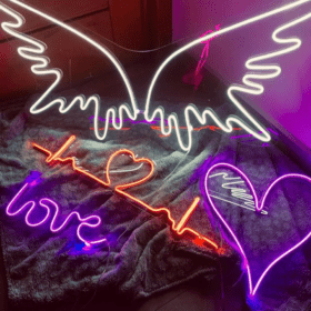
Neon — bent glass or LED neon in a flexible sleeve — is a line, not a volume. That makes it the better product whenever you want handwriting, a continuous script, a symbol drawn in one gesture. It holds its warmth at close range and photographs beautifully, which indoors is often the point: a bar, a lounge, a salon, a wall people stand in front of with a phone. If that is your brief, read our page on custom neon signs and ignore the rest of this.
When 3D letters win
Four situations push the decision firmly towards fabricated letters.
The sign lives in sunlight. A facade has to perform during working hours, not only after dark. Depth and shadow do that; glow does not compete with the sun.
The name is long, or the logo has a fill. Neon script works down to a few words. A full company name, a heavy wordmark, a logo with a solid shape inside it — those are cut and built, not bent.
The sign is high up, or far away. A letter read from across a road needs weight, contrast against its background, and enough strength to sit in wind at that height. A letter read from two metres away in a corridor can be delicate. To check, print the artwork at full size, tape it to the wall and walk back to where your customers actually stand.
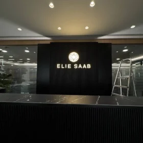
The building is the brand. On a headquarters, a showroom or a hotel entrance the signage is architecture, judged alongside stone, glass and cladding by people who notice a misaligned baseline. Our signage for the Elie Saab HQ sat in that category: letters that had to read as part of the building rather than something applied to it.
The wall decides more than the letter
This is the part that gets skipped. Halo lighting needs a pale, flat, continuous surface to throw onto; on dark stone or rough render the glow disappears. Letters on standoffs look sharp on a smooth wall and messy on an uneven one. Glass and cladding need their own fixings, and every illuminated sign needs a cable route and a driver reachable later without dismantling the facade.
So we ask for photographs of the wall, straight on and from the side, before quoting. It changes the design more often than the artwork does — which is the thinking behind all our 3D signage work: the sign and the surface are one decision.
Mixing the two
Nothing says you must choose. A backlit metal logo outside, with a line of neon script in the space it leads into, is one of the combinations that works best: the letters identify you from the street, the neon sets the mood once people are inside. We make both in the same Jdeideh workshop, along with the custom sculptures and forms that sometimes come with them, so one team answers for how they sit together.
Frequently asked questions
Are 3D letters suitable for outdoor use in Lebanon?
Yes, when built for it: metal returns, sealed construction, outdoor-rated power supplies and fixings chosen for the wall. A facade is a different specification from an indoor reception sign, so tell us where the sign is going before anything is drawn.
Can you match a specific brand colour?
Yes. Faces and returns are finished to the colour you specify, and we will say honestly when a colour that works on paper will read differently lit from behind.
Which is cheaper, neon or 3D letters?
It depends on size, materials, finish and the number of characters, so there is no useful general answer. Send the artwork and the dimensions and you get a real figure rather than a range.
Talk it through before you commit
Send the logo file, the wall measurement and a photograph of where the sign is going, and we will tell you which of the two the job actually wants — including when the answer is neon rather than letters.
Message us on WhatsApp or use the contact page. Everything is designed and fabricated in our own workshop in Jdeideh, Metn, with delivery and installation nationwide, and you are welcome to see the finishes in person at the showroom facing St. John Greek Orthodox church.