

Blog
Making a Neon Sign From a Sketch: Bending, Mounting and Wiring
A sign usually reaches us as a word on a phone screen — a name typed in the notes app, handwriting photographed on a napkin, a logo drawn for a letterhead and never meant to glow. All three are a fine place to start, and none of them is a sign yet. What separates artwork from something that hangs on a wall and lights up is a series of decisions made on the bench.
First, the artwork becomes a line
A logo is an image. A neon sign is a line — a continuous run of tube or flex that has to be physically formed and physically supported. So the first job is redrawing the artwork as a path, and that is where most designs change slightly.
Stroke weight. Letters drawn too thin look broken when lit, because the eye reads the gaps rather than the word; drawn too heavy, the letterform disappears into a glowing blob. Script and rounded sans-serif shapes translate well, fine serifs and hairline contrasts badly.
Breaks in the line. The dot on an “i”, the counter of an “a”, a crossbar that does not quite touch — each is a separate run needing its own start, end and hidden connection. A word that looks like one gesture on paper is often four or five pieces in the workshop.
Size. A curve can only be formed down to a certain radius, which sets a minimum practical letter height, and complex scripts need to be larger than block letters. We work that against reading distance: a sign above a bar is read from four metres, one behind a reception desk from one.
Then the line gets formed
Glass neon is bent by hand: the tube is heated over a flame until it softens, worked by eye against a full-size paper pattern on the bench, then sealed with electrodes, evacuated and filled with gas. The colour comes from the gas and the tube’s inner coating, not from paint on the outside.
LED neon is a flexible light core in a diffusing silicone sleeve. It bends in one plane, so it is shaped flat against a cut backing, and corners too sharp to bend are cut and joined instead. It is the more common choice for interiors now, and we set out the trade-offs in our comparison of LED and glass neon.
The backing decides how the sign reads
Almost every modern sign is carried on an acrylic backing, and that choice changes the character of the piece more than people expect. Clear acrylic cut to a rectangle leaves the letters apparently floating. Acrylic cut to follow the letters themselves removes the frame entirely and reads as pure line on the wall. A painted, black or mirrored panel makes the sign a defined object with a border. Outdoor work is usually built into a shallow box, which protects the joints and gives the fixings something to bite into. The backing is also where the wiring hides, which is why the next decision comes before anything is drilled.
Wiring: the part that gets decided too late
LED neon runs on a low-voltage driver, and that driver has to live somewhere reachable and ventilated, not sealed inside a wall cavity. Glass neon runs on a transformer at much higher voltage and needs a proper enclosure and a competent connection.
So before the acrylic is cut we ask where the nearest power point is, and drill the cable exit on the side facing it, so the lead runs the short way rather than across the face of the sign. We also settle how it will be switched: an inline switch, a dimmer, a remote, or wired into the lighting circuit so it comes on with everything else — which is what most restaurants and shops want, because nobody remembers to switch a sign on. Outdoors adds sealed joints, a weather-rated driver and a drip loop: build decisions, not accessories.
Mounting, and the day it goes up
A sign is only as secure as what it is fixed to. Plasterboard, concrete, stone cladding and timber all take different fixings, and the holes are drilled into the acrylic during fabrication rather than improvised on site. Signs sit flush to the wall or on standoffs that lift them clear, throwing a halo of light onto the surface behind.
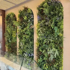
Signs mounted over greenery need one extra thought. They fix to the wall or to a sub-frame behind the panels, never to the foliage, and the cable is routed before an artificial green wall is closed up. Retrofitting a cable through a finished wall is untidy, so mention it early.
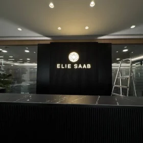
Height matters too. If the sign exists partly so people photograph themselves in front of it — and many do — it needs to sit where a phone held at chest height frames it, which is lower than instinct suggests. Everything is test-lit in our Jdeideh workshop before it leaves, and again on the wall. Fabricating signage ourselves is how we end up on projects where the brief is exact: the signage for Elie Saab’s headquarters was made here.
Frequently asked questions
Can you make a sign from my own handwriting?
Yes, and handwriting often works better than a typeface because it is already a continuous gesture. Send a photograph of it written large on plain paper; we redraw it as a path and show you the adjusted version before anything is formed.
Does a neon sign get hot enough to be a problem near artificial foliage?
LED neon runs warm at most, so it sits safely above or within greenery. Glass neon and its transformer get hotter and need clearance. Tell us it is going on a green wall and we specify accordingly.
Can you match an exact brand colour?
Close, usually, but not always exactly. Lit colour comes from the light source itself, in a defined range rather than mixed like paint. We will show you the nearest options in the showroom rather than describing them.
Bring us the sketch
You do not need a vector file, a font name or a size. A photograph of the words written by hand, plus a photograph of the wall, is enough for us to tell you what will work and what needs adjusting. Finished pieces are lit at the showroom in Jdeideh, facing St. John Greek Orthodox church, where you can see how custom neon signs and 3D signage differ in person.
Message us on WhatsApp or through the contact page. We fabricate in-house in Jdeideh, Metn, and deliver and install nationwide.