

Blog
Colour Beyond Green: Blossom, Bougainvillea and Seasonal Accents
Walk a client through a moodboard and the word “green” ends up doing far too much work. It stretches over the grey-silver of olive, the near-black of a mature rubber plant, the acid yellow-green of new ficus growth — and then it stops, usually at the exact point where the scheme needs something else. Colour is the most under-used tool in artificial greenery, partly because it is easy to overdo, and partly because nobody explains how little of it you actually need.
What colour does that green cannot
Green reads as texture. It fills volume, softens hard surfaces and stays in the background even when there is a lot of it. Colour does the opposite: it pulls the eye to one point and holds it. A single flowering branch at the turn of a staircase takes more attention than three metres of dense foliage along a corridor.
So colour is a placement decision before it is a species decision. Before anyone talks about blossom or bougainvillea, the question is where you want people to look — the sightline from the door to the reception desk, the wall behind a bar, the corner that ends up in every photograph. Put colour there and it earns its place; put it where nobody faces and it just looks left over.
Restraint is the whole trick
The most common mistake we are asked to fix is colour spread evenly: blossom threaded through an entire green wall, pink at regular intervals along a planter run. Evenly spaced colour reads as decoration — festive, temporary, a little like a shop at Christmas. Nothing in nature flowers on a grid.
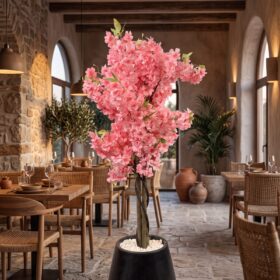
The alternative is simple to describe and harder to resist: let green carry the volume, and let colour arrive once. On a green wall, that means a drift of colour sitting off-centre and running upward and outward, the way a climber actually takes a wall — heavier where it started, thinning as it goes. On a tree, it means a few branches carrying blossom while the rest stay plain, usually on the side that faces the light.
Which colours hold up, and which ones give themselves away
Not every colour behaves once it is in a real room under real light.
- Magenta and deep pink — the bougainvillea range is a Lebanese colour and it reads from a distance. It sits beautifully under warm light but can shift towards violet under cool white LED, so check a sample under the lighting the space actually has.
- White blossom — the most elegant and the least forgiving. It shows dust before any other colour, and in a dim room it drops towards grey rather than glowing.
- Fruit — lemons, oranges, olives — the fastest way to look artificial, because everyone knows precisely how big a lemon is and how its skin catches light. Fruit works when it is sparse and partly hidden inside the canopy, the way it hangs on a real tree, and fails when it is placed on the outside of the foliage where it can be seen whole.
- Copper and autumn tones — underrated, and very good next to warm wood, brass and stone. They read as a season rather than as a flower, which makes them easy to live with year-round.
Outdoors, colour has one extra demand. Pigments in reds and pinks are usually the first to shift under direct sun, so coloured foliage on a terrace or a driveway needs anti-UV material rather than the indoor equivalent in the same shade — the first thing to ask about if the piece will get afternoon sun.
Colour that is not foliage at all
Sometimes the warmth a room is missing has nothing to do with the canopy. A terracotta, oxide-red or deep green planter delivers the accent at floor level, framing the tree instead of competing with it.
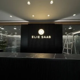
Light is the other route. A warm wash across green foliage makes it read richer than any pigment will, and a neon sign set behind greenery gives a space a second colour scheme that only appears after dark, with no change to the planting at all.
Seasonal accents without buying a second tree
A tree built in our Jdeideh workshop can be made so the canopy is serviceable — branch tips that come away, clusters added or removed without disturbing the structure. That is a decision made at build time, so it belongs in the first conversation: say you want the piece to change through the year and a custom tree can be designed to carry blossom for a few months and return to plain foliage for the rest, instead of committing the room to pink permanently.
Where colour belongs in a commercial space
In restaurants, colour works at the entrance and in whichever corner guests photograph; in the dining room, green is the safer choice, because the food should be the brightest thing on the table. In retail the rule is almost absolute — if the product has colour, the greenery should not. In offices and clinics, colour belongs in reception and waiting areas, not where people are trying to concentrate.
Frequently asked questions
Does coloured artificial foliage fade faster than green?
Outdoors, reds and pinks are generally the most sensitive to sun, which is why coloured pieces destined for terraces, driveways and poolsides should be built with anti-UV foliage from the start. Indoors, away from a window that gets direct sun, colour holds very well.
Can blossom be added to a tree I already have?
Often yes, depending on how the canopy was built and whether the branch structure will take the clusters cleanly. Send a few photographs, including a close shot of where the branches meet the trunk, and we can tell you whether it is worth doing.
How much colour is too much?
A reasonable test: if you can see the colour from every position in the room, there is too much of it. Colour should be something you find when you turn, not something you cannot escape.
Thinking about adding colour?
Bring a photograph of the space, ideally at the time of day that matters most — the lighting tells us more than the dimensions do. Everything we make is built in our own workshop in Jdeideh, Metn, to whatever size and palette the space needs, with delivery and installation anywhere in Lebanon. You are also welcome at the showroom in Jdeideh, facing St. John Greek Orthodox church, to see the colours in person.
Message us on WhatsApp or use the contact page, and we will talk it through.